Light it up
〰️
Light it up 〰️
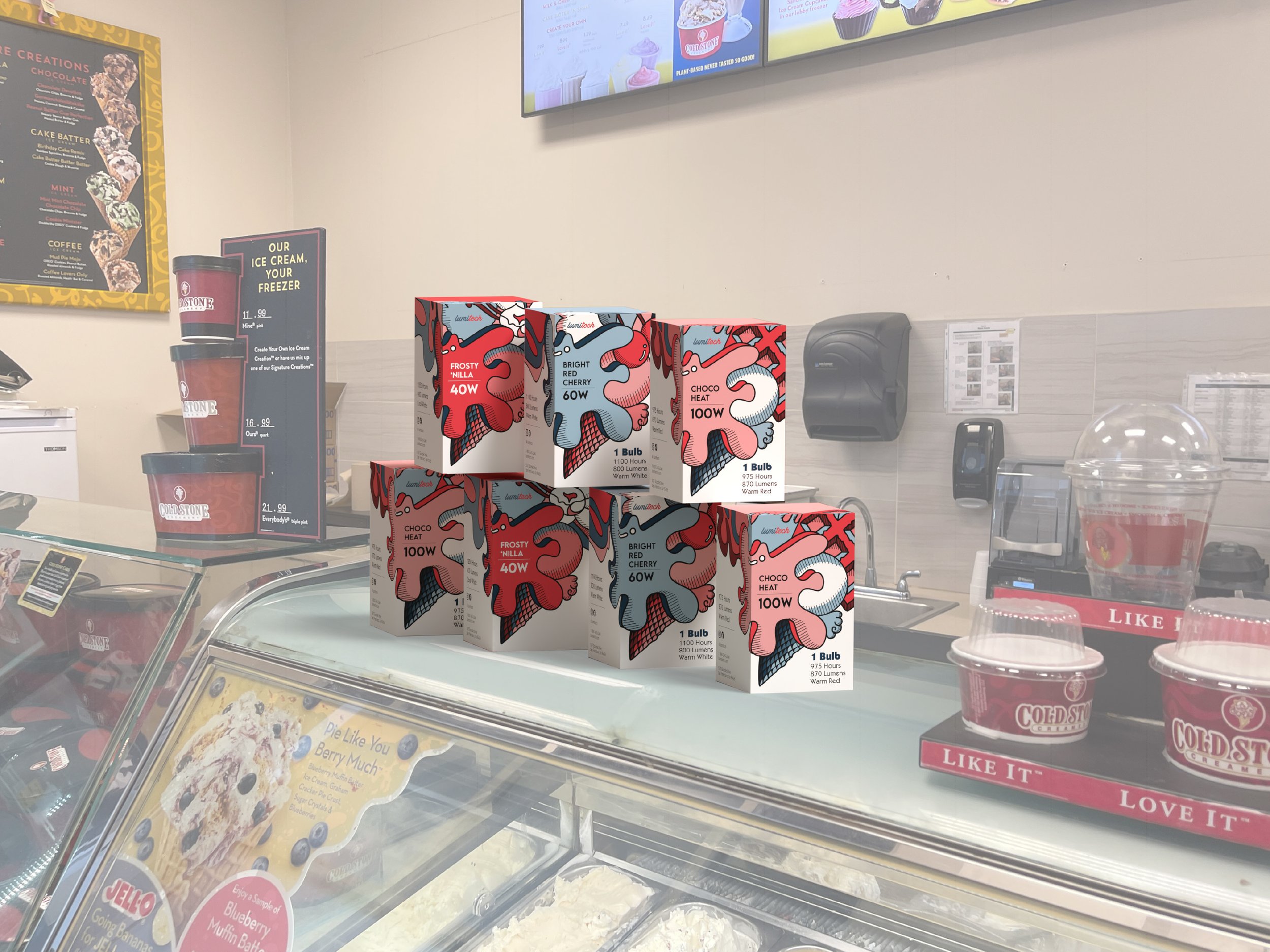
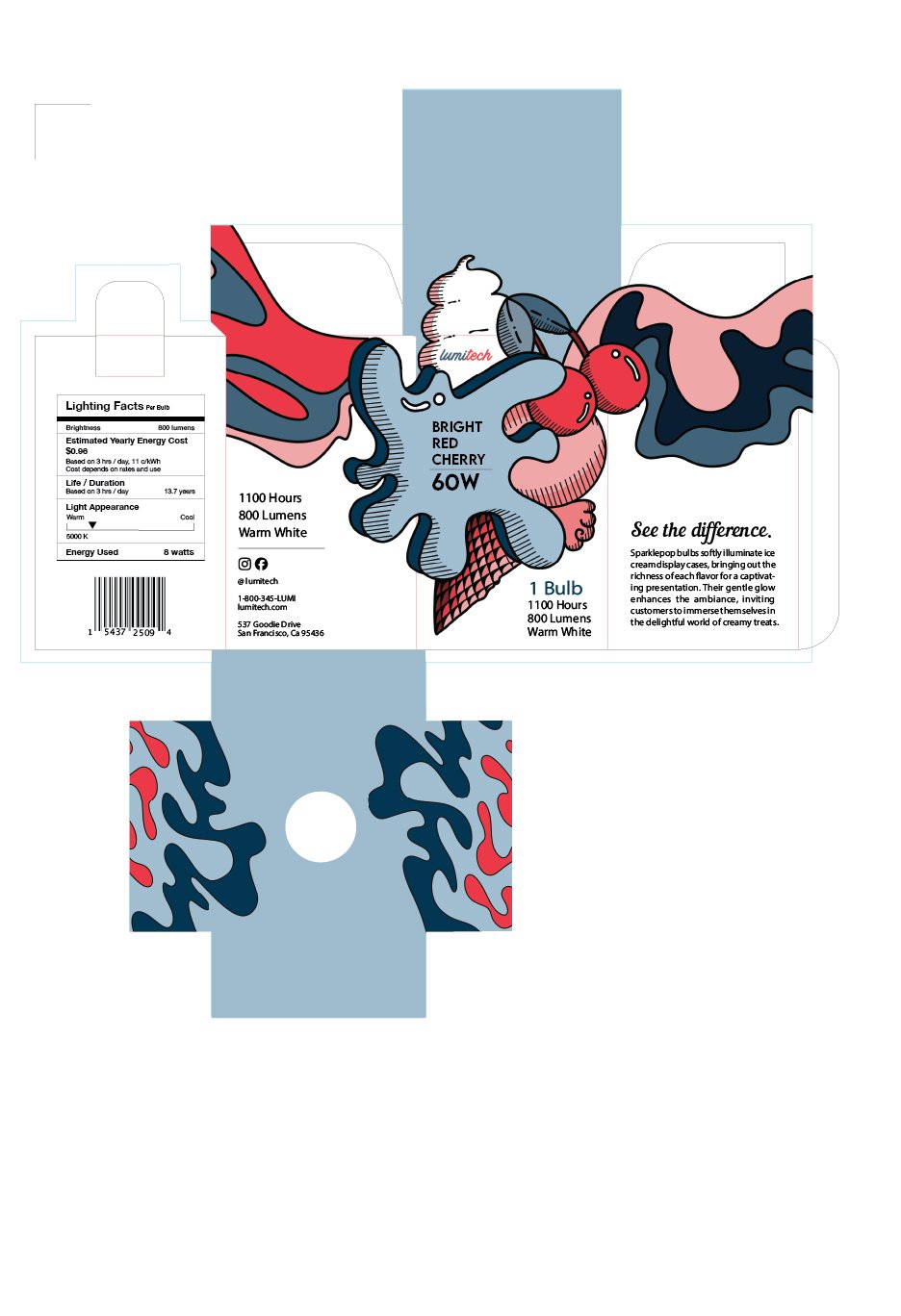
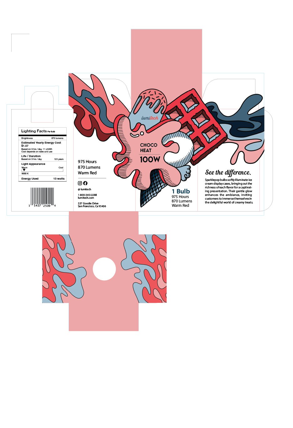
Lumitech Lightbulb Packaging Series
This lightbulb package design series draws visual inspiration from the vibrant color palette and playful nostalgia of a classic ice cream shop. Each package features a unique bulb color and wattage, unified through consistent typographic hierarchy, layout structure, and illustrative style. Strategic use of color theory and repetition establishes brand cohesion, while shifts in color and subject matter create visual interest across the set. The result is a cohesive yet dynamic series that balances whimsy with clarity, appealing to both design-savvy consumers and everyday shoppers.

Creative Process
Beginning with simple sketches of sweet treat ideas below, I was eventually lead to play with scale and add swirly graphic elements that give a playful element to the packages.